Feel Good
Feel Good
A restyling and expansion project for Feel Good, a health and wellness brand offering protein food, body care, sports snacks, and vitamin supplements. Each product line was given a distinctive colour and symbol system, then modernised through minimalist packaging and a new relaxation line designed from scratch.
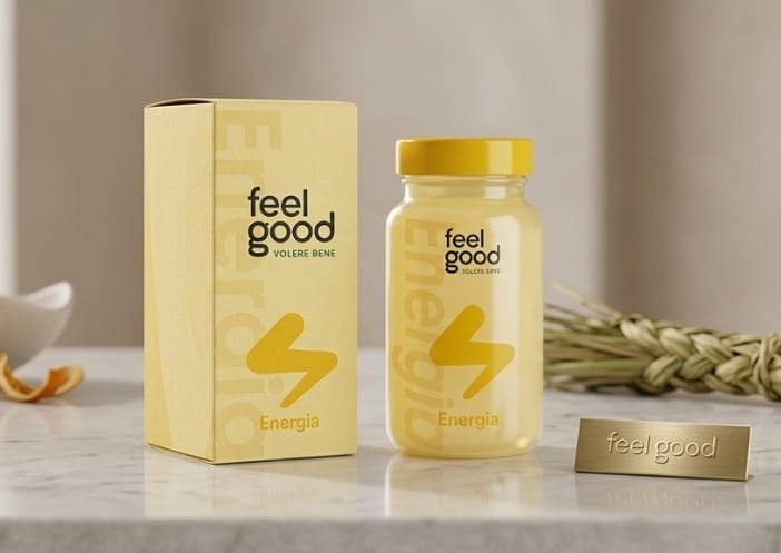
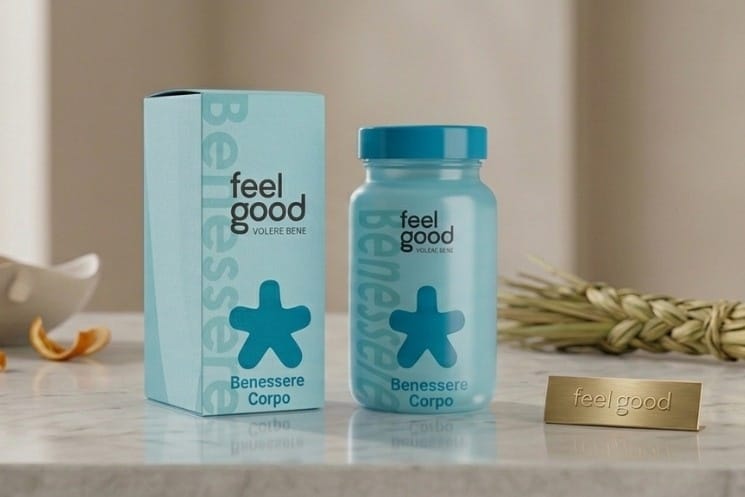
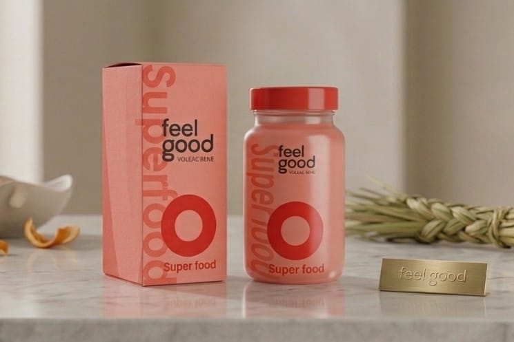
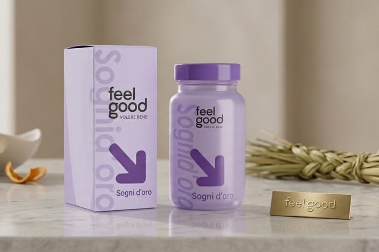
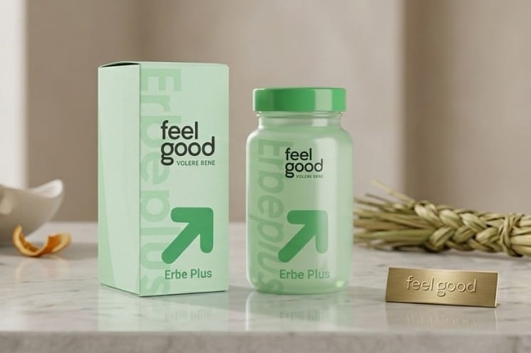
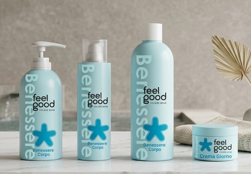
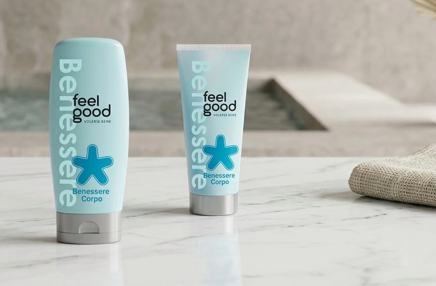
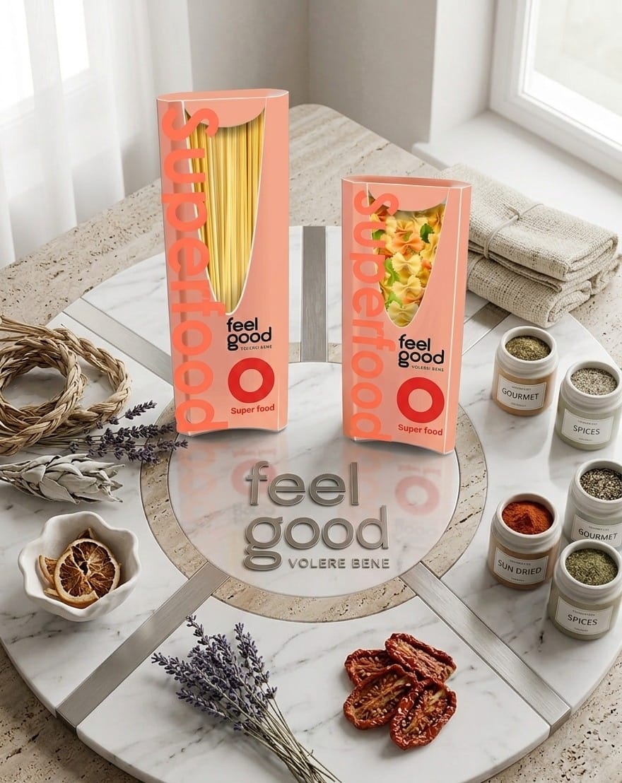
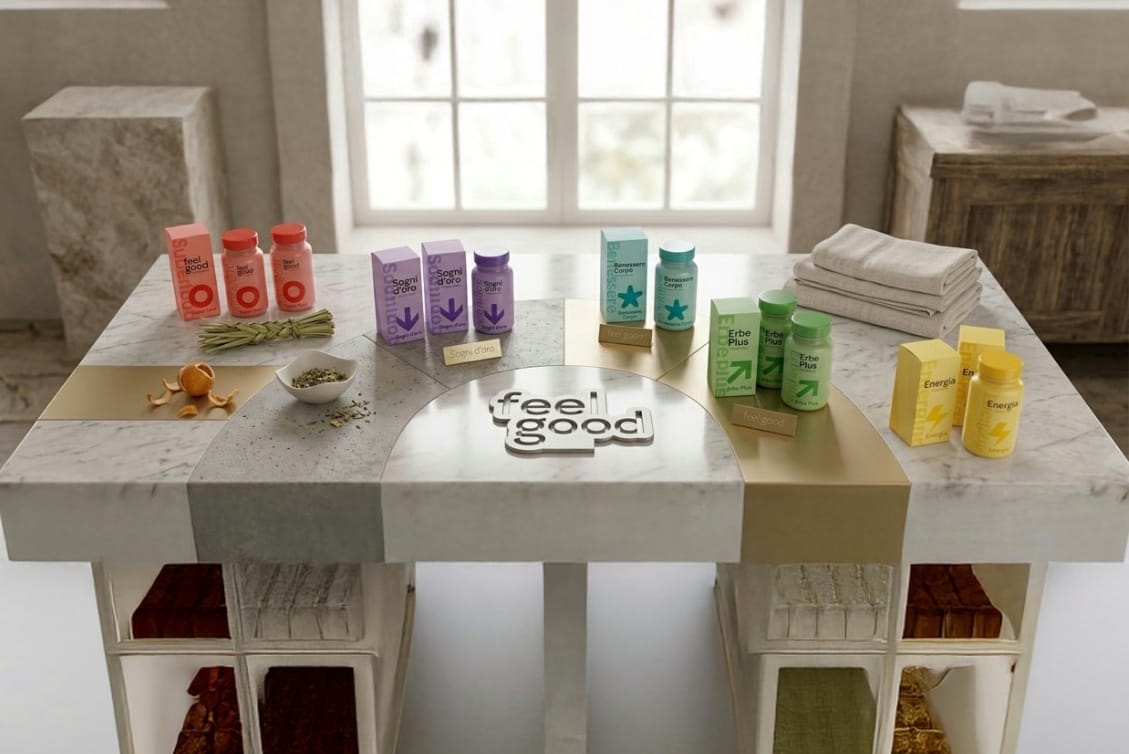
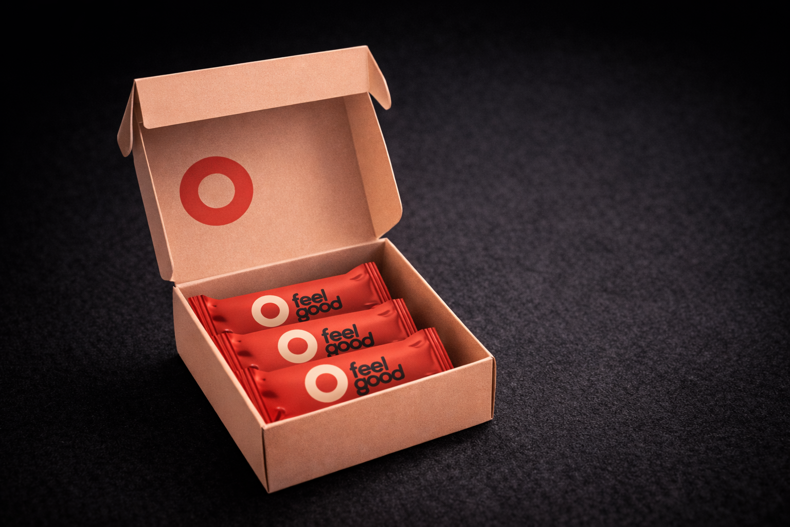
Feel Good is a brand dedicated to health and wellness, with four core product lines: food, body care, sport, and supplements. Each line operates within a shared visual identity built on a distinctive colour and symbol pairing: red and a ring for food, blue and a flower for body care, yellow and a lightning bolt for sport, and green and an upward arrow for supplements. The project involved both a full restyling of the existing range and the introduction of a brand new relaxation line, identified by purple and a downward arrow, designed to help manage anxiety and improve sleep.
The restyling focused on two core directions: adopting a minimalist aesthetic and increasing colour vibrancy. Gradients were simplified, packaging was cleaned up, and the overall visual language was made sharper and more readable on shelf. For the new supplement range, packaging was developed inspired by the Bloom case study, featuring an outer box with a logo cutout that reveals a removable inner box containing either pill jars or blister packs. A dedicated point-of-sale display was also designed to improve product visibility and the in-store shopping experience.
A cohesive, modernised identity system across five product lines, with packaging that is cleaner, bolder, and easier to navigate. The new supplement packaging introduces a distinctive unboxing experience, while the relaxation line expands the brand into a new emotional territory, anchored by a calm, purposeful palette and a symbol that speaks directly to rest and recovery.