Crispy Sicily
Crispy Sicily
A bold, appetite-driven logo for Crispy Sicily, an arancini franchise launching in the United States. The goal was to capture the warmth, energy, and irresistible crunch of Sicilian street food and translate it into a mark that could work on everything from packaging to signage to staff uniforms.
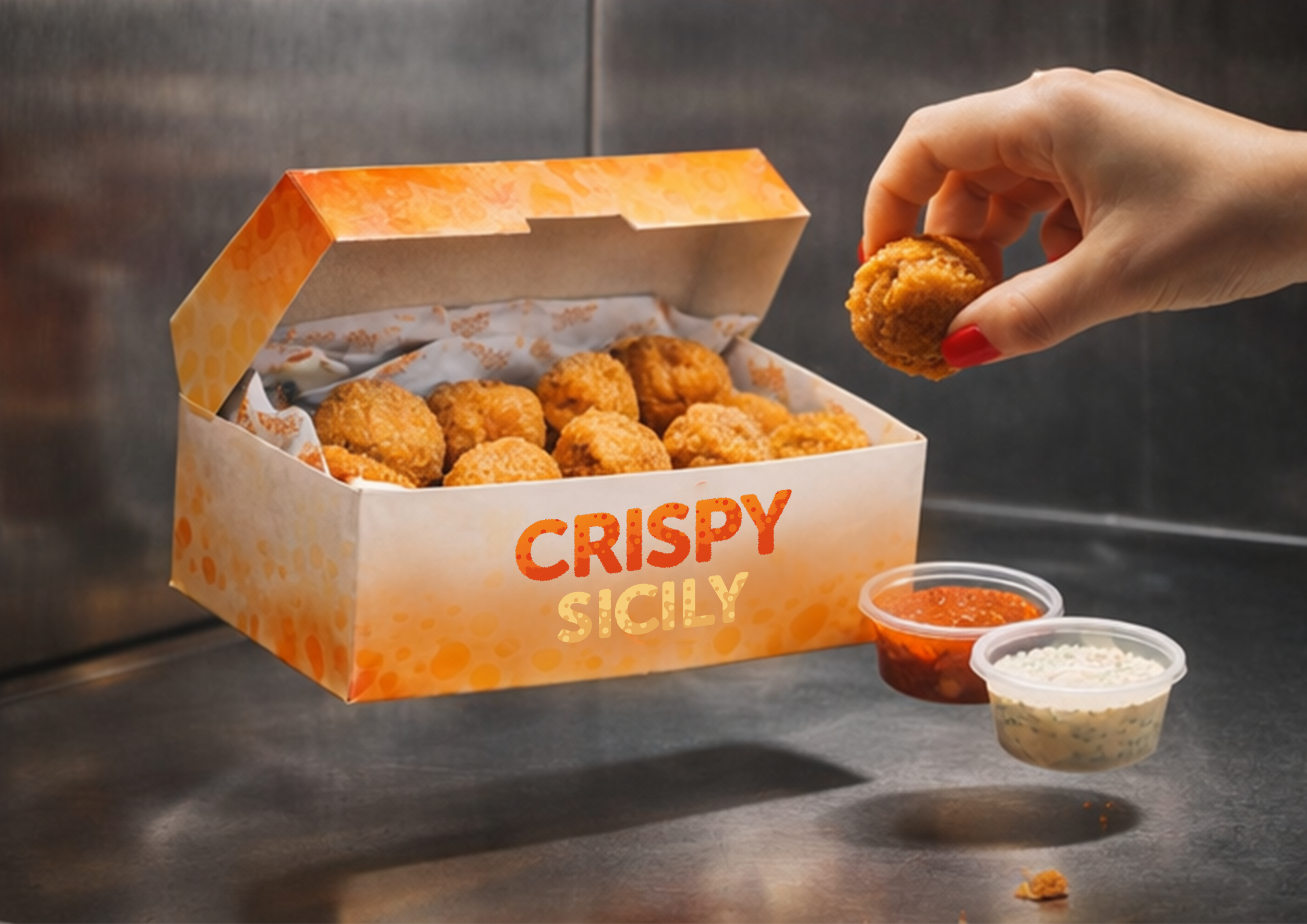
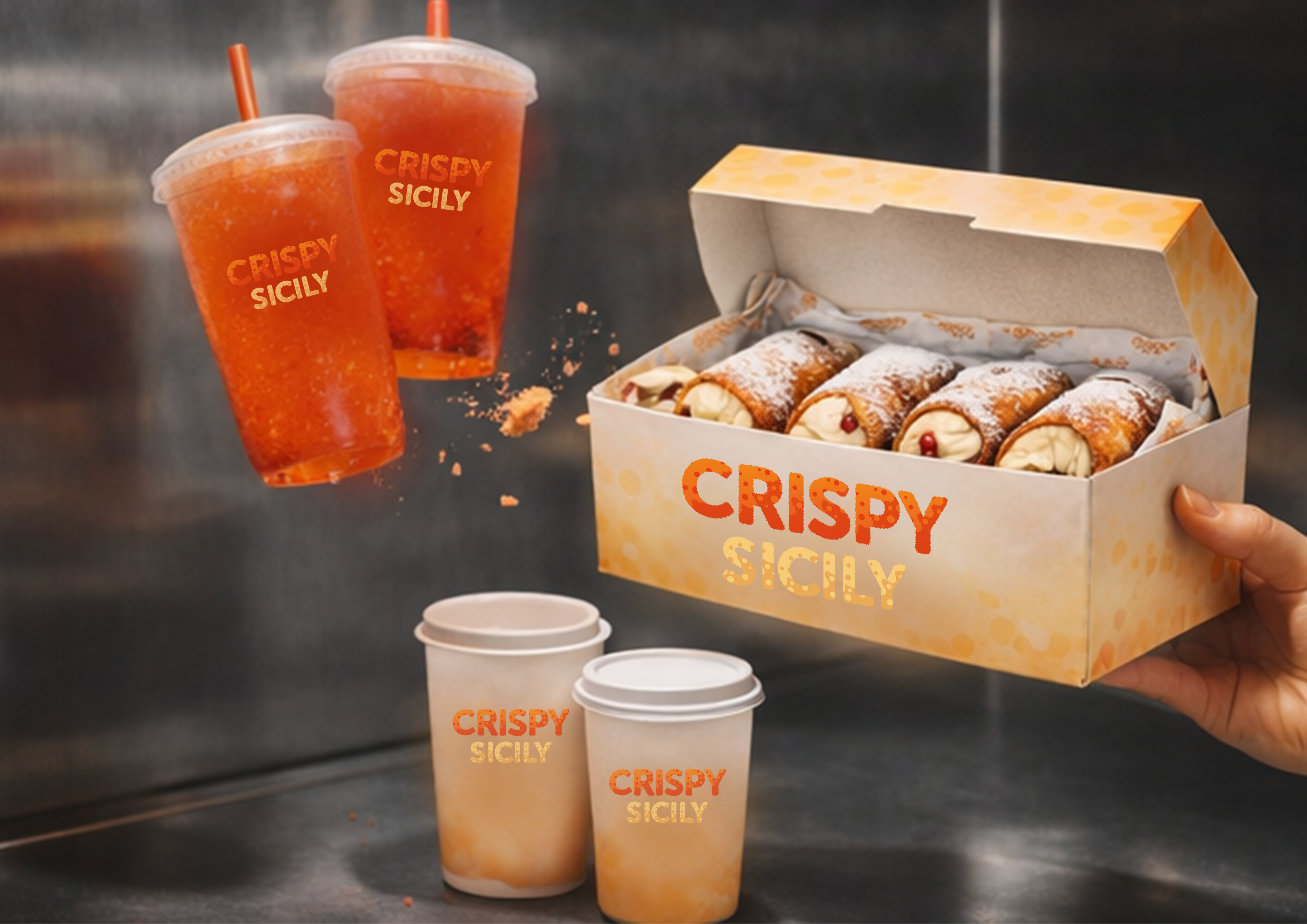
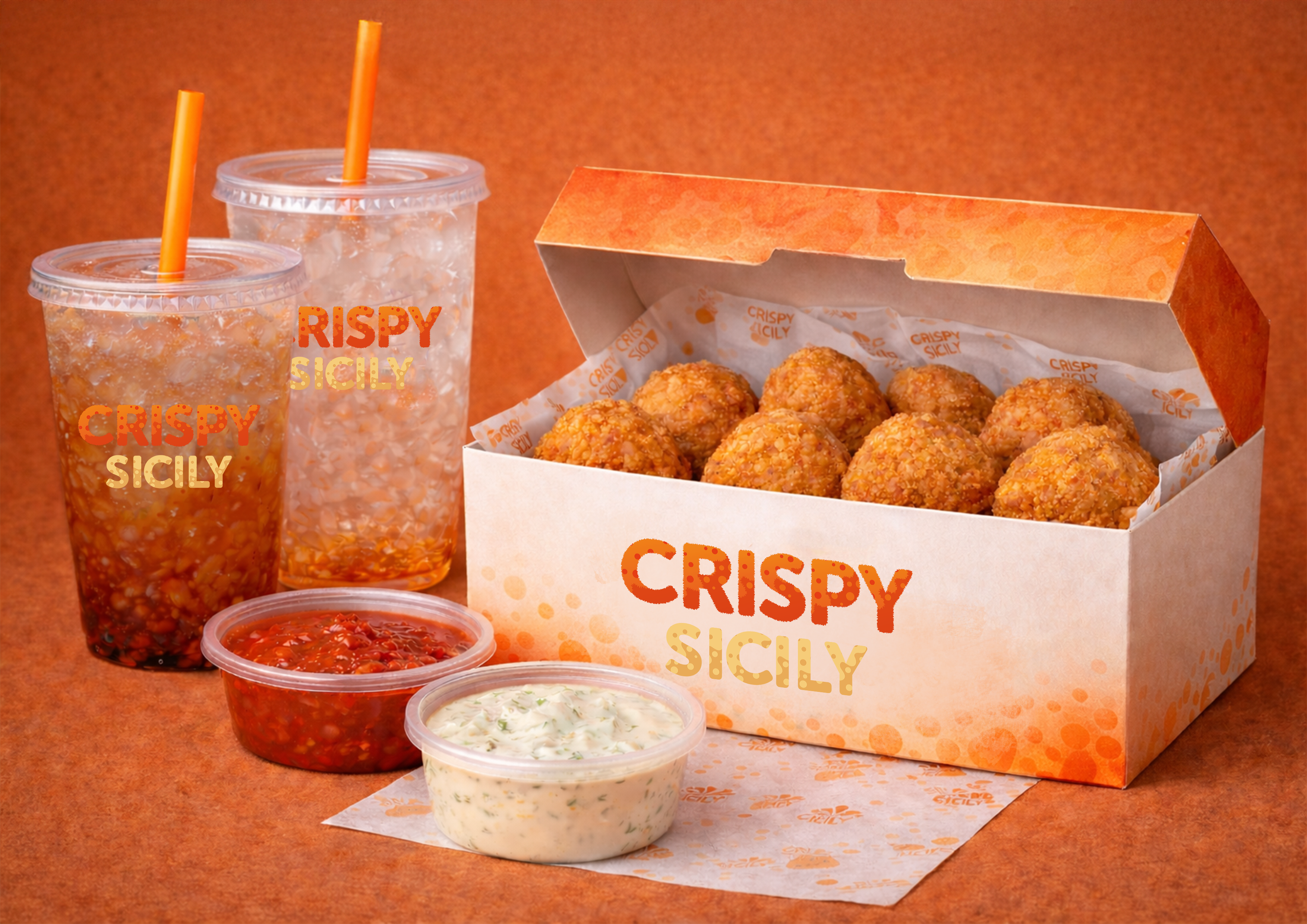
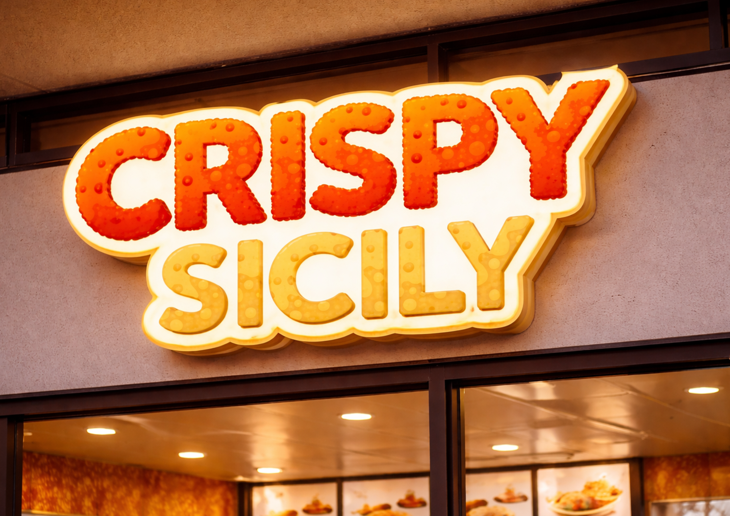
Design a logo for an arancini franchise entering the American market that feels unmistakably Italian and full of personality, while being versatile enough to scale across packaging, signage, uniforms, and cups. The identity needed to be instantly recognisable and communicate warmth, fun, and quality at a glance.
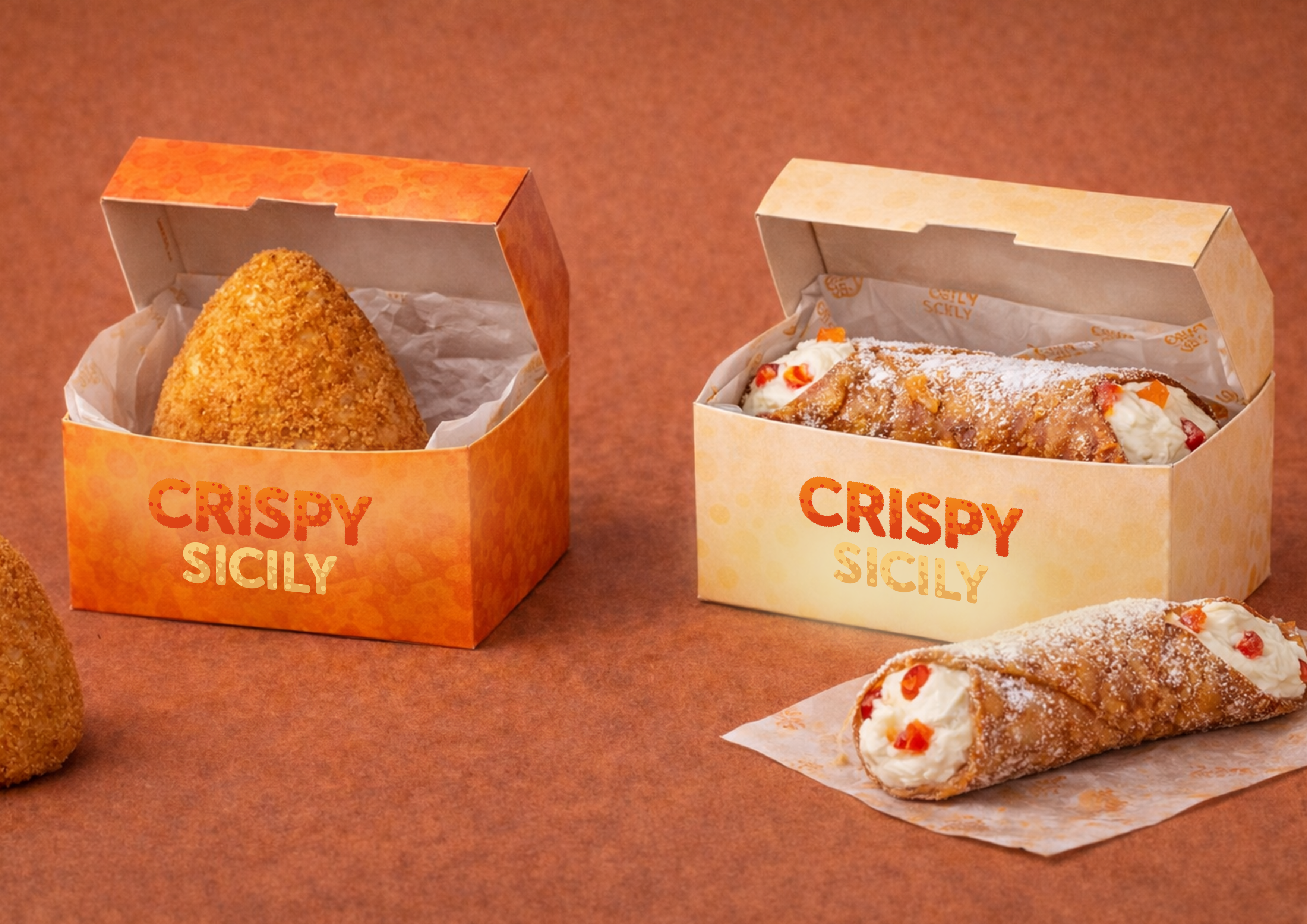
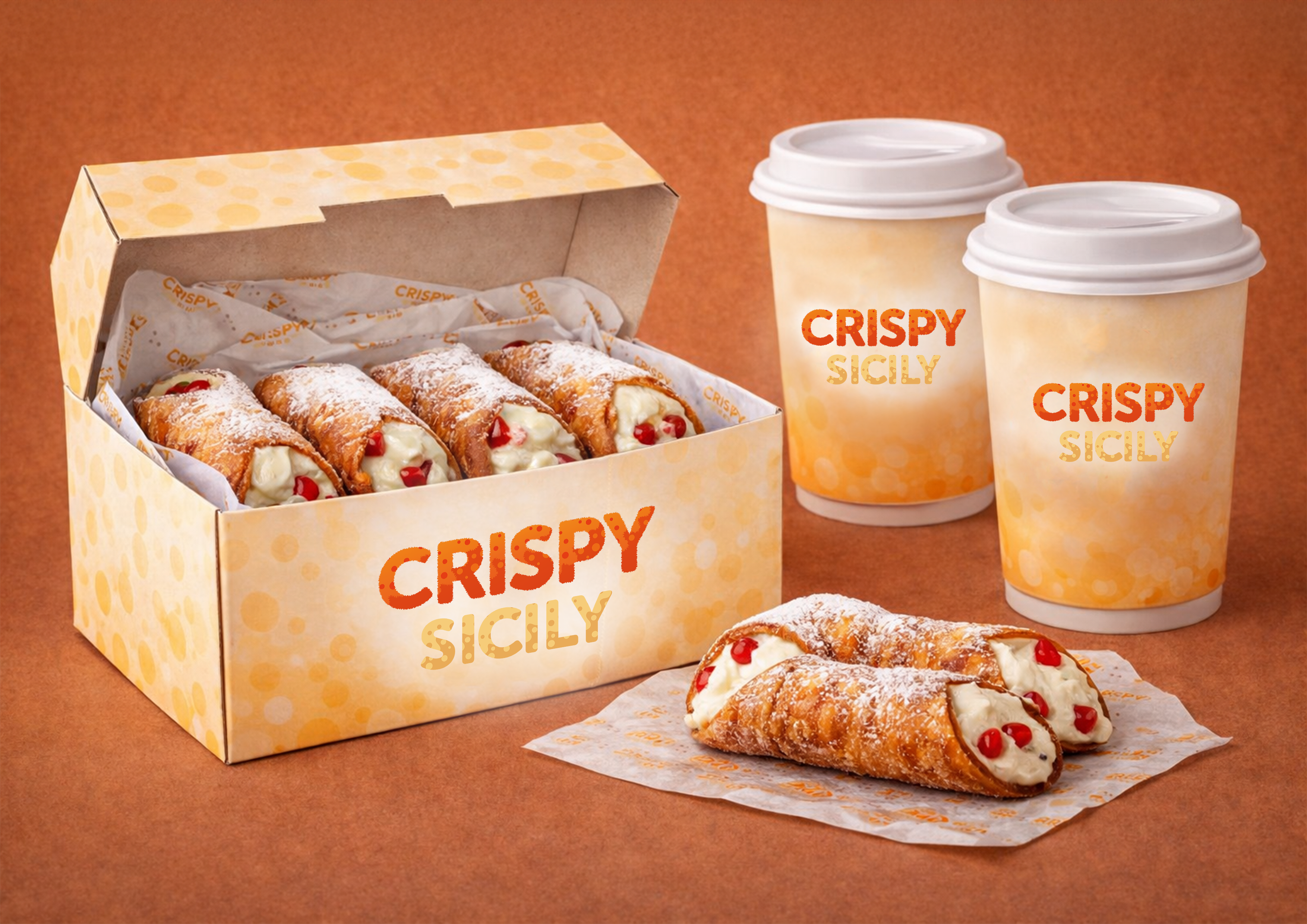
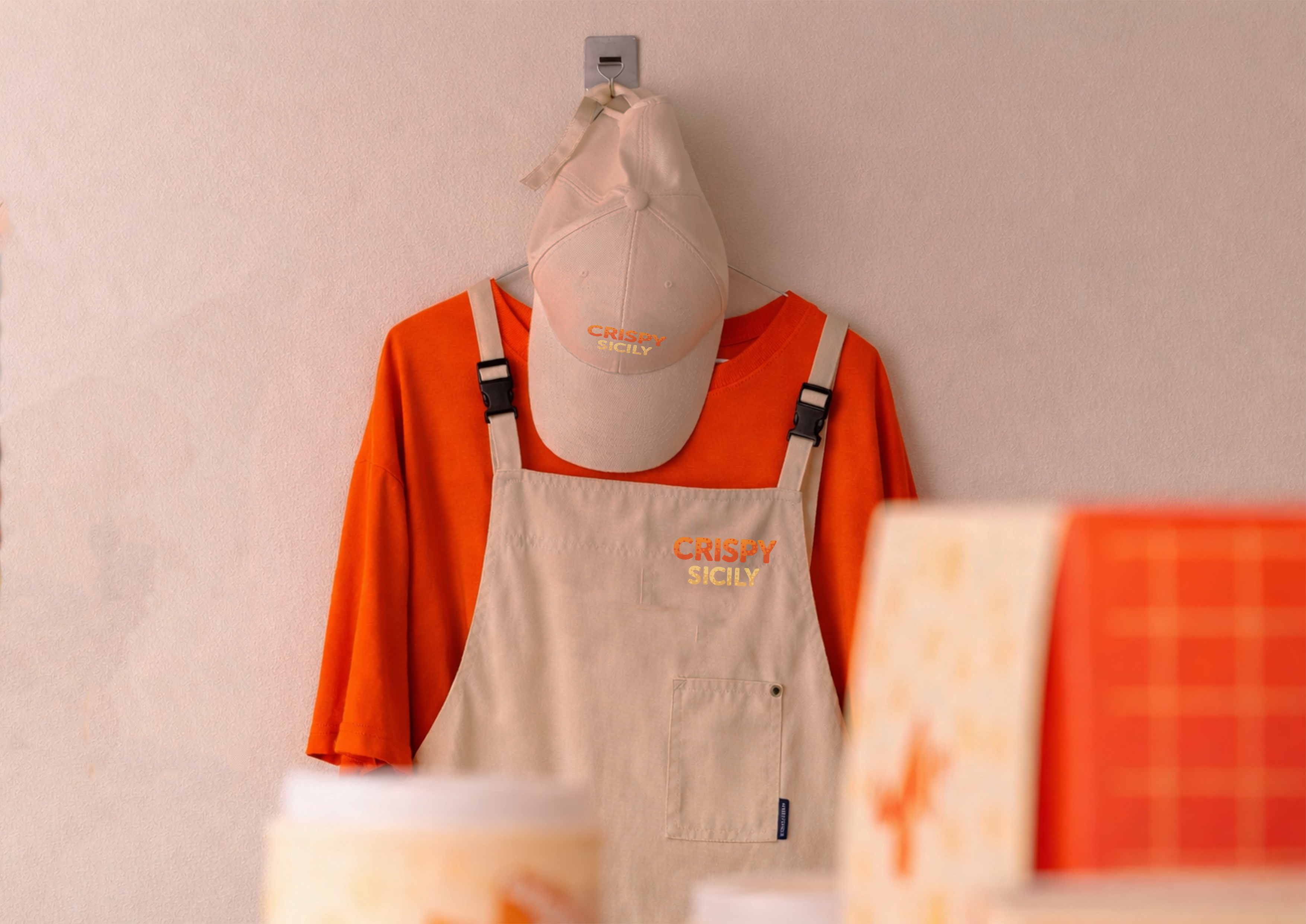
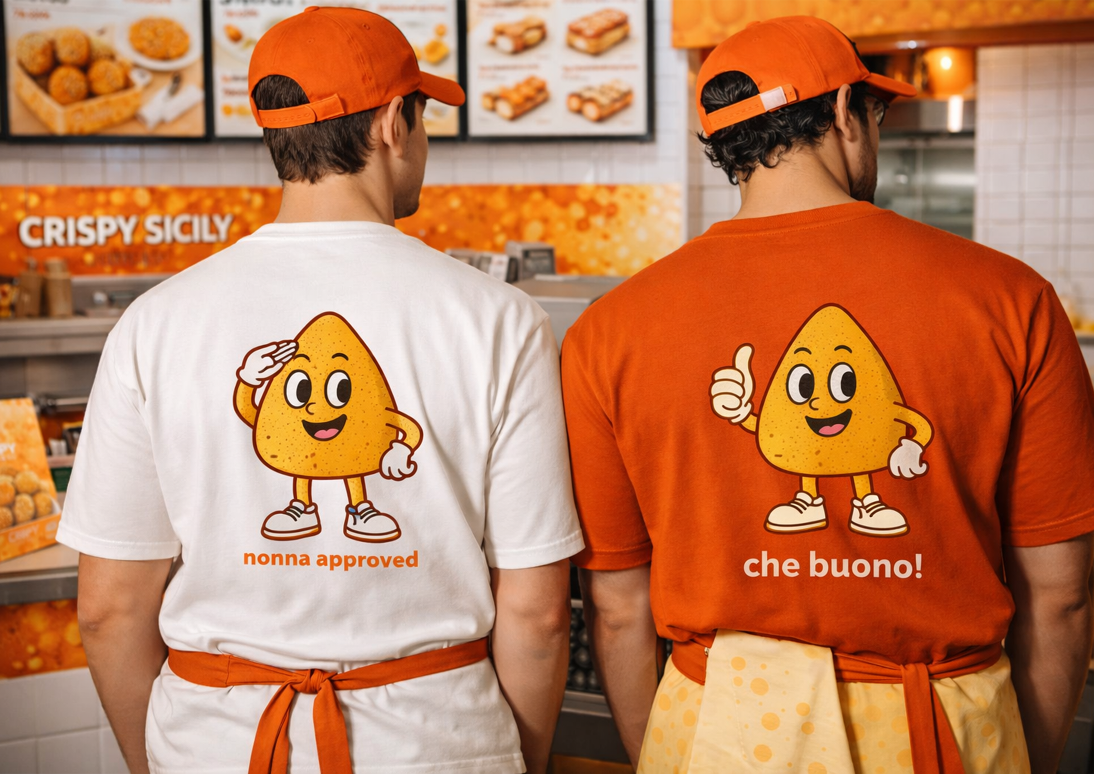
The typography was designed to feel bold and textured, referencing the crispy, golden exterior of a perfectly fried arancino. A warm palette of deep orange and golden yellow carries the heat and energy of Sicilian street food, while remaining appetising and approachable. A custom arancino character was developed for staff uniforms, adding a playful, mascot-like dimension to the identity with slogans like “nonna approved” and “che buono!”
A complete, franchise-ready visual identity applied across takeaway boxes, cups, wrapping paper, aprons, caps, T-shirts, and storefront signage. The identity travels across every touchpoint with consistency and character, turning each piece of packaging into a piece of the brand story.